Eliminate render blocking CSS to improve start render time
Although this website scores a perfect 100 in PageSpeed Insights, that doesn't mean things can't be improved. First time visitors on slower connections used to see nothing for over 1.6s before finally seeing a fully rendered view. I'd like to explain how I rendered the view more progressively with inline and async CSS to improve start render time by 0.6s.
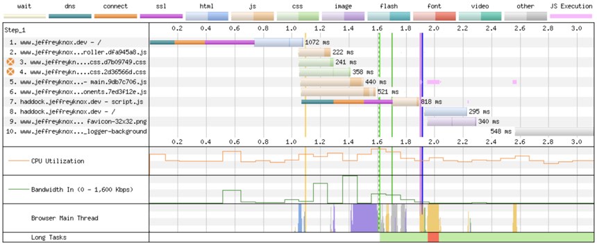
The best place to begin is with a sample run of my homepage on WebPageTest on an Emulated Motorola G (gen 4) device using a Chrome browser with a 3G fast connection.

From this you can see that there are 2 render blocking CSS assets, marked by white x's on an orange background to the left of the asset name. This means that there will be absolutely nothing on the screen until those assets have finished being downloaded and parsed. You may also notice that, even with this done, there is still a period of time before start render occurs which is represented with the final vertical green line. Just before this, there is an intensive block of purple in the browser main thread which is taken up with layout and paint.
You can see the effects of this in the following filmstrip.

The screen is totally blank until 1.7s, at which point there is a fully rendered view. Not a very progressive load I'm sure you'll agree!
The ideal solution
My preference was to have at least something on the screen very soon after the page content has been fetched at around 1s. Creating this impression in the users mind that at least something is happening is very important to keep the user hanging around. Too much time with a blank screen and they'll quickly abandon the visit and move onto something else.
Therefore, my plan was to have the background colour visible as well as the navigation component at the top of the screen before finally displaying the rest of the content.
In order to make this happen, I needed to alter my CSS so that I inlined the portion of CSS required for the background and navigation and then load the rest of the CSS asynchronously. Having a minimal area of the screen rendering straight away meant that I wouldn't have to inline too much CSS. It's a bit of a balancing act but I try to keep at 5kb's worth or under (this value is the total before any compression with gzip or brotli) of inlined CSS. You'll take the pain of downloading that inlined CSS on every page load because it can't be cached with the rest of your assets so it's best to keep it as minimal as possible.
My approach
I fired up my dev server and loaded the home page. Next, I opened the Chrome Dev tools and navigated to the Network tab. Finally, I right clicked on each of my CSS files and selected to block the request URL. Then when I reloaded the page I had a totally unstyled page and this made it easy to then start adding the inlined styles to get to a point where I only added the bare minimum to achieve the initial load I was after.
The next part is going to vary depending on your asset bundling setup but I'll show what I did and hopefully that will give you some pointers. I use Vite under the hood but with my site being Ruby based I used Vite Ruby to add some additional helper methods. If you like, you can read more about this setup here.
Usually I would call my CSS files in the head with the following helper method as an example
vite_stylesheet_tag early_paint_css, "data-turbo-track": "reload"
but instead I changed the method call to
vite_inline_css "early_paint_css"
and then added this vite_inline_css method to my helpers.
def vite_inline_css(asset_name)
  return build_inline_css(asset_name) if @app.build?
  vite_stylesheet_tag asset_name, "data-turbo-track": "reload"
end

...

private

def build_inline_css(asset_name)
  asset_path = vite_asset_path(asset_name, type: :stylesheet)
  altered_path = "build#{asset_path}"
  "<style type='text/css'>#{File.read(altered_path)}</style>"
end
If the static site is being built, as noted by @app.build? then I find the path to the asset file that has been built by Vite and then take the content of that file and output it in place between style tags. I can't do this in development because Vite doesn't create a bundled file (that's why it's so fast) so in development I simply serve the file as a render blocking resource as I was doing before.
With that done I could start going through the gradual process of taking CSS out of the other asset files and adding it to my early_paint_css.css file until I had all that I needed.
One final very important piece of CSS I had to add to the end of that file was
.container:not(:first-child) {
  display: none;
}
Again, this is very much going to vary depending on the structure of your site. In my case, the body of the HTML looks roughly as follows
<body>
  <div class="container"></div>
  <div class="container"></div>
  ...
</body>
with the first div being the nav component. Therefore any container classes that come after this should not be displayed initially. If you don't do this then you're going to get a flash of unstyled content (FOUC) which looks pretty janky. The easiest way to then show this content again is to add the following to the main CSS file which is loaded in asynchronously
.container:not(:first-child) {
  display: block;
}
At the point this is loaded, you have the majority of the styles required for a stable view without any noticeable FOUC.
One thing I should mention is that using display: none; seems to be a safer bet than using visibility: hidden;. This is how I had originally implemented a similar solution at my work and it worked really well with the Core Web Vitals scoring but then months later we suddenly started seeing lots of poor scoring for Cumulative Layout Shift (CLS). I was a bit stumped by the change and only after quite a bit of experimenting did I discover that shifting to display: none; fixed it. There had been no visible shifting on the screen and to the user the 2 solutions looked exactly the same but the algorithm for CLS must have changed to start picking up on the shifts with visibility set to hidden.
Asynchronously loaded CSS
If you're following along, you will likely notice that things don't look very different and nothing is rendered until the CSS files have loaded in. The final piece of the puzzle is to load these files async.
Loading CSS asynchronously isn't quite so simple as loading JavaScript asynchronously but here is an excellent article from the Filament Group that explains how to do it.
Like before, I changed my use of vite_stylesheet_tag to instead use my own helper method.
vite_async_css "main_css"
and the helper code implementation looks as follows
def vite_async_css(asset_name)
  "#{preload(asset_name)}\n#{noscript(asset_name)}"
end

...

private

def preload(asset_name)
  vite_stylesheet_tag(
    asset_name,
    rel: "preload",
    as: "style",
    "data-turbo-track": "reload",
    onload: "this.onload=null;this.insertAdjacentHTML('afterend', '#{vite_stylesheet_tag(asset_name)}')"
  )
end

def noscript(asset_name)
  "<noscript>#{vite_stylesheet_tag asset_name, "data-turbo-track": "reload"}</noscript>"
end
I had to alter the onload implementation because I'm using HOTWire Turbo Drive for speedier page transitions by not requiring full page reloads. For those that haven't used this before, check out the link to read more about it.
If I kept the implementation as it was in the Filament Group demo, then the change of the media key from print to all means that Turbo thinks the link tag has been altered and then always does a full page reload on page transitions. I could stop this from happening by removing the "data-turbo-track": "reload" from the link but this could cause some breaking change. This data attribute helps when I've pushed changed to my assets. If the user has loaded a page with one finger printed version of the assets, then before they move to a new page I have pushed a code change to my assets and then they visit a new page, Turbo Drive will recognise that the finger printing is different and force a full reload. Therefore I don't want to remove that or the layout could look broken.
Final result
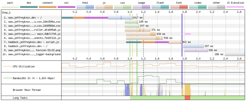
That's all the changes I needed to make this work. To be honest, the trickiest part was finding what CSS to strip out and inline. Now for the part you've been waiting for, the final result. Here we go with the WebPageTest run with the same settings as before on an Emulated Motorola G (gen 4) device using a Chrome browser with a 3G fast connection

As you can see, the render blocking assets are no longer an issue and the start render is starting considerably earlier. Here is the filmstrip view as well

and you can see that I now have some content rendering on the page a rather impressive 0.6s earlier making for a much more progressive and satisfying page load.
On larger sites this can take more time to implement but I feel the results are certainly worth it and hopefully you'll see more users sticking around to read your awesome content!
Please let me know if you've done something similar, or if you have any questions at all about this article. I always love to hear how others are improving the performance of their sites.
Update 8th Jan 2021
I recently received a Twitter message from @chsweb about trying out a more accessible approach than using display: none; in my early_paint_css.css file (see the thread here). This totally makes sense because hiding the content to eliminate FOUC and help CLS only makes sense for sighted users. No point punishing users with screen readers by initially making the content unreachable.
Jono pointed me to an article about hiding content accessibly and I altered my early_paint_css.css file to be as follows:
.container:not(:first-child) {
  clip: rect(0 0 0 0);
  clip-path: inset(50%);
  height: 1px;
  overflow: hidden;
  position: absolute;
  white-space: nowrap;
  width: 1px;
}
and then altering the asynchronously loaded main CSS file to be
.container:not(:first-child) {
  clip: auto;
  clip-path: none;
  height: 100%;
  overflow: visible;
  position: relative;
  white-space: normal;
  width: 100%;
}
to make the content visible again. I tested things locally and it functioned exactly the same and lab tests showed there was no negative CLS impact. I made the change 6 days ago and have been keeping an eye on my own Core Web Vitals dashboard and performance still looks great!
I'm very happy with this approach and I hope the article on hiding in an accessible way helps others to take this approach as well.